Worked with Steve Bean Games, a small game boutique on a couple of gaming titles:
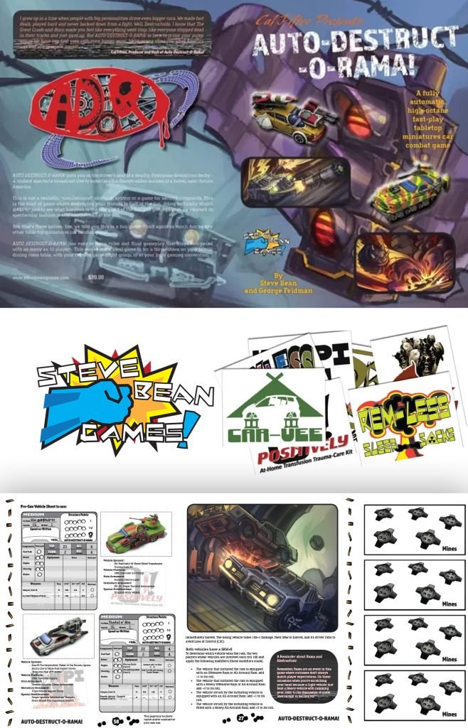
Auto-Destruct-O-Rama
Shade Hunter: Nowhere City Lights Campaign
Shade Hunter: Nowhere City Lights Campaign: We did a few cartography pieces pertaining to location blueprints and layouts.
Auto-Destruct-O-Rama: We did the overall rulebook layout and many of the graphic design pieces inside the book. We also did the game’s logo and the book cover. The vibe of the game was a post-apocalyptic car wars race, think Death Race 2000, not the remake. Take a look inside the rulebook here!
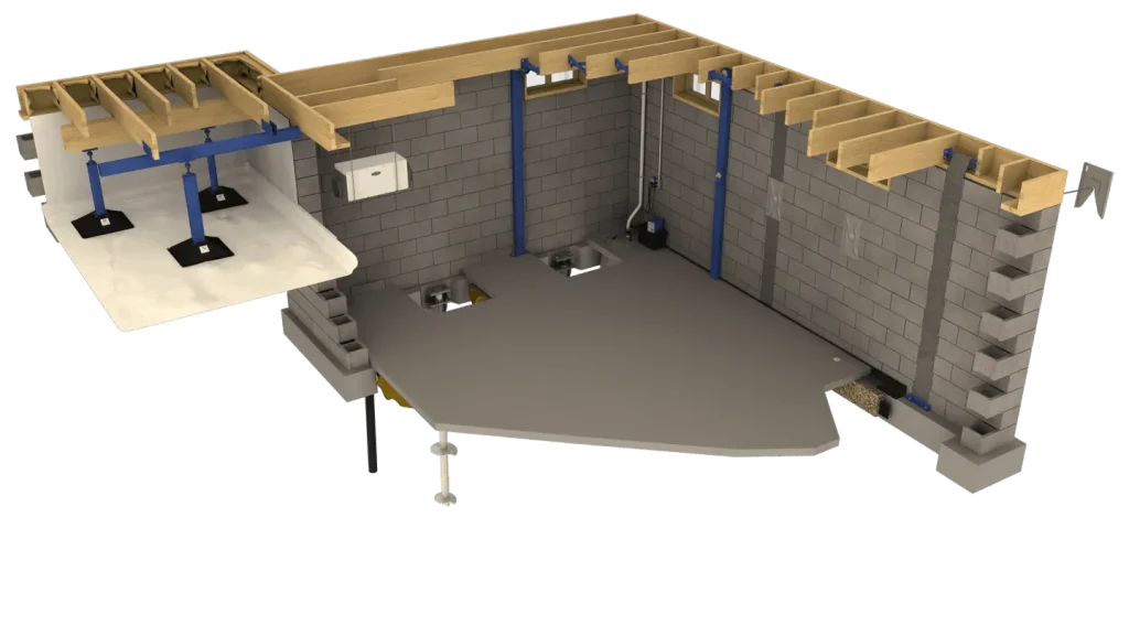
Three-dimensional image of a basement with a crawlspace built using LightWave 3D. This image was used in various promotional materials showcasing the various product lines they manufactured and third-party products they sold.
LightWave Digital: LightWave 3D.
Case Study —
Brochure Redesigns
- Waterproofing System
- Push Pier System
- Helical Pier System
- Wall Anchor System
- Waler Wall Support System
- Carbon Fiber Support System
- Pro-Series Sump Pumps
- Sump Baskets Options
- Dehumidifier Options
- Radon Testing & Mitigation
- Poly-Jack Concrete Lifting
- Encapsulation System
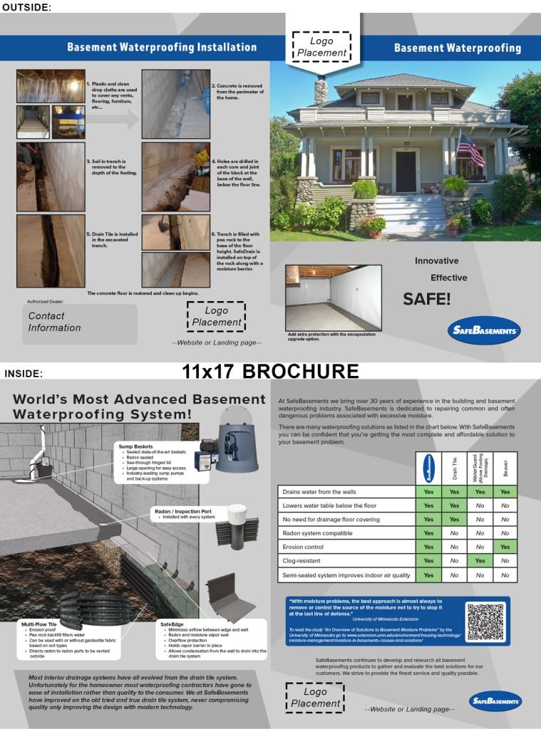
The original brochures that SafeBasements, Inc. offered couldn’t be altered to fit their customer’s needs. They wanted a solution that could.
The original brochures that their customers could purchase were a predetermined design that would be ordered and then have a white printed mailing label slapped on before handing them over to homeowners.
At the time I was the in-house designer and we wanted to make these more personalized for the companies buying them as they handed them out to homeowners looking for solutions.
As we worked out the details, we needed the solution to be an easy way to change out company logos, add contact information, and be able to swap out photos.
So the first step was to get the working file to begin the process. This proved to be a non-starter as they were jpegs of the front and inside of the brochure.
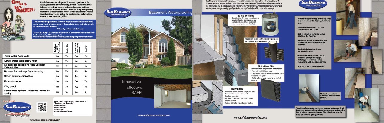
We went about updating the brochure in Adobe InDesign and Photoshop. We were able to rebuild the brochure and break apart the file into editable and locked layers.
The locked layer contained important manufacturing details. The editable layers we could swap out company logos and write in contact information. Various photos had the option to be updated with provided company images.
We have multiple locations on the inside and outside of the brochures for company logo placement. The white ribbon on the top-left front is able to accept various logo sizes without having to adjust them.
We have the mailing label area on the bottom-left back so you can easily type in the company information.
We took great care in picking out the installation photos that showed only the process, we didn’t want any conflicting photos with people wearing company attire. However, these photos could be swapped out with company-specific photos.
The right thing to do and the hard thing to do are usually the same. -Steve Maraboli
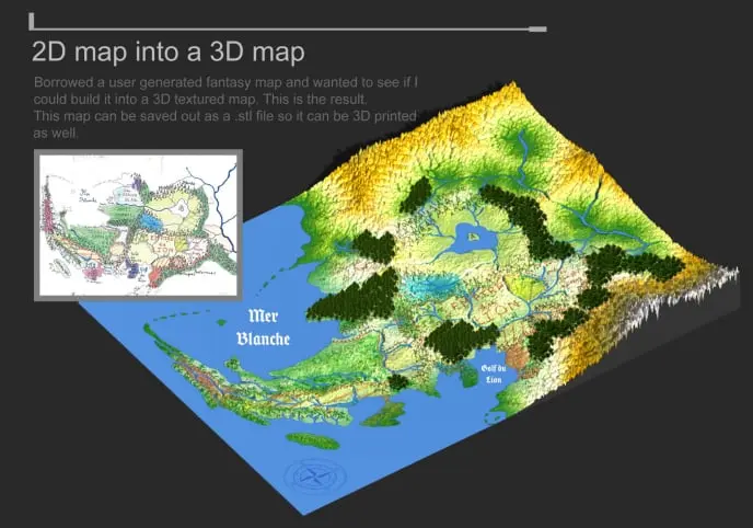
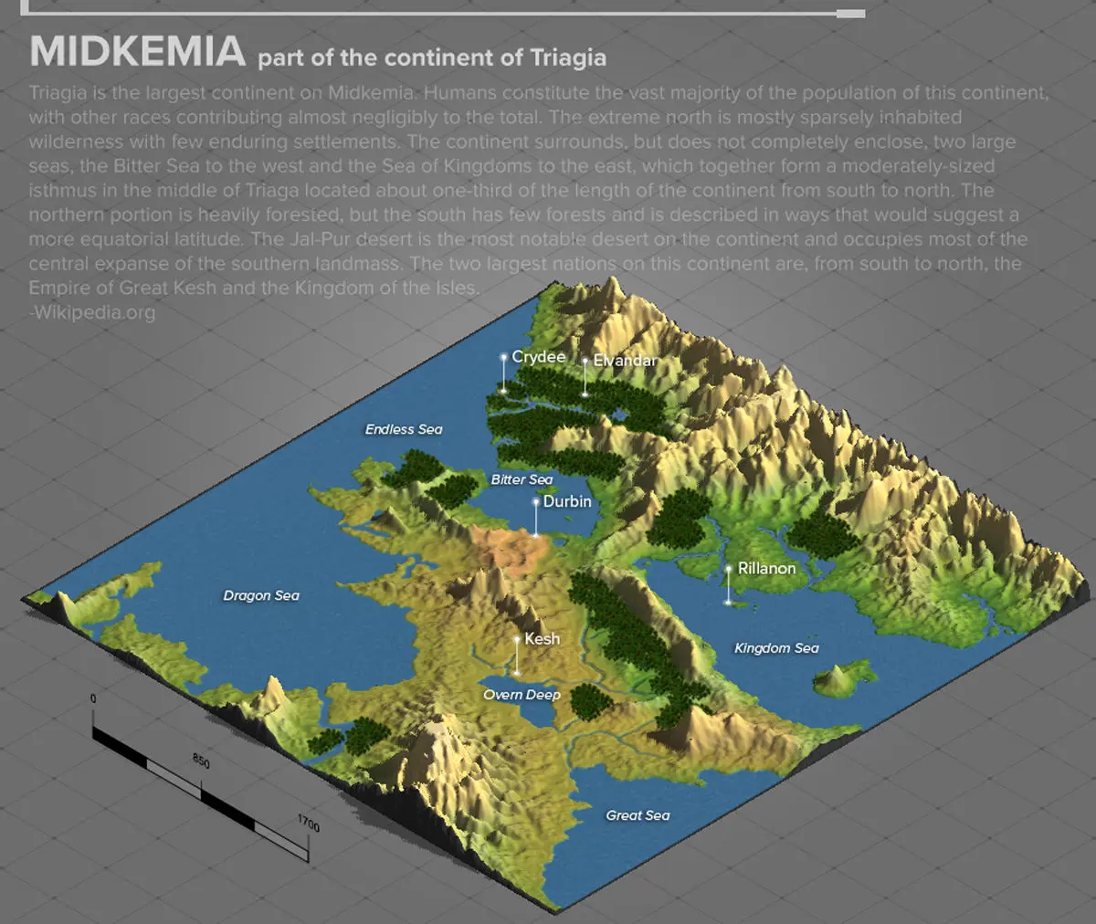
Maps were constructed using Wilbur, LightWave 3D, and finished in Adobe Photoshop.
The topography of the maps could also be 3D printed.
I took a 2D hand drawn fictional map and turn it into a 3D relief map.
Three-dimensional representation of MIDKEMIA, one of the fantasy worlds in the Riftwar Saga created by Raymond E Feist.
Case Study —
Logo Development
Helped a start-up find its logo and worked with another company looking to update theirs.
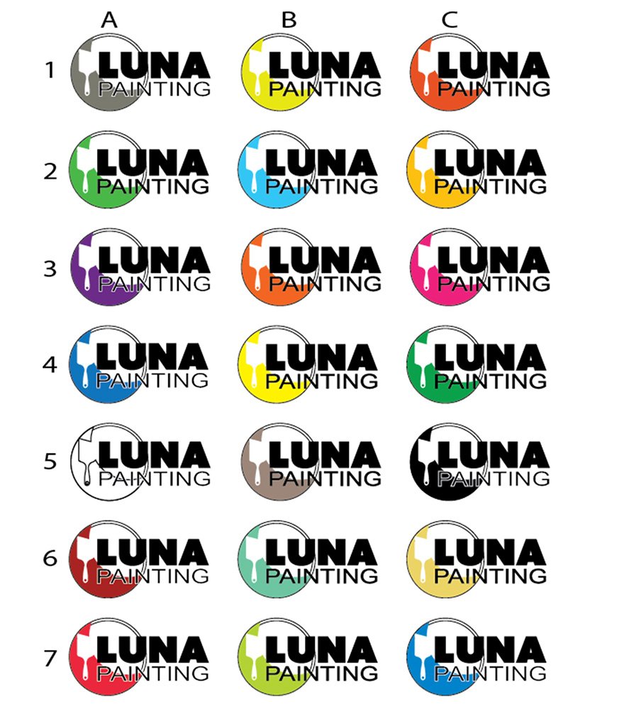
We were contacted over the phone, and yes we picked up, they were looking for a logo they could use for the interior painting business they started. They were having trouble narrowing down a logo solution.
We began using their surname as inspiration for the company’s logo direction, Luna Painting.
We start with actual paper and begin sketching ideas.
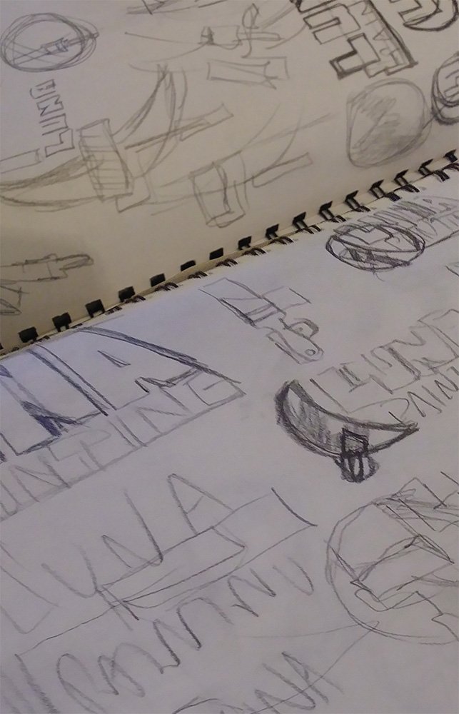
After we do the pen and paper, we begin to digitize them. From there we send them over and have them narrow down the solutions they like, not focusing on colors just the logo elements for now.
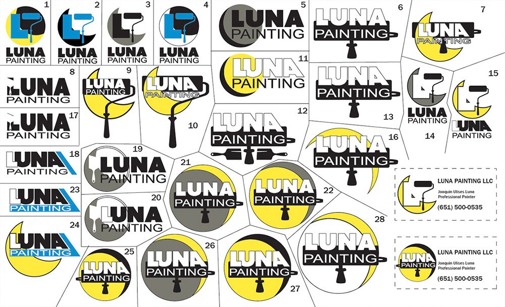
They are more than welcome to mix and match elements. All we ask is that they specify what elements from the numbered logos they like and we can begin kitbashing them before we move on to color options.
After the color options are made we begin finalizing the logo and make adjustments and revisions as needed as we work towards the final product.
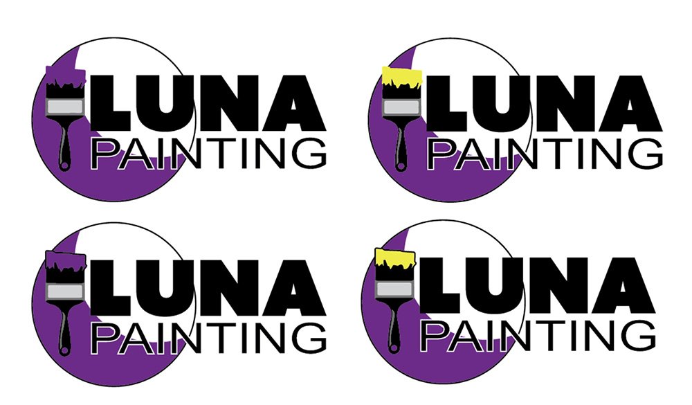
We are in the home stretch, they choose which option they like best from the final four. From there we build a one-page logo guide, with color codes and spacing rules.
We do offer them a chance to get business cards as well if they would like and we go through the process again with business card design choices.
Motion Graphics
Book Trailer using custom-built 3D and 2D elements, we put together this minute-plus book trailer drawing inspiration and feel from the opening credits of the original film. Built within the square format.
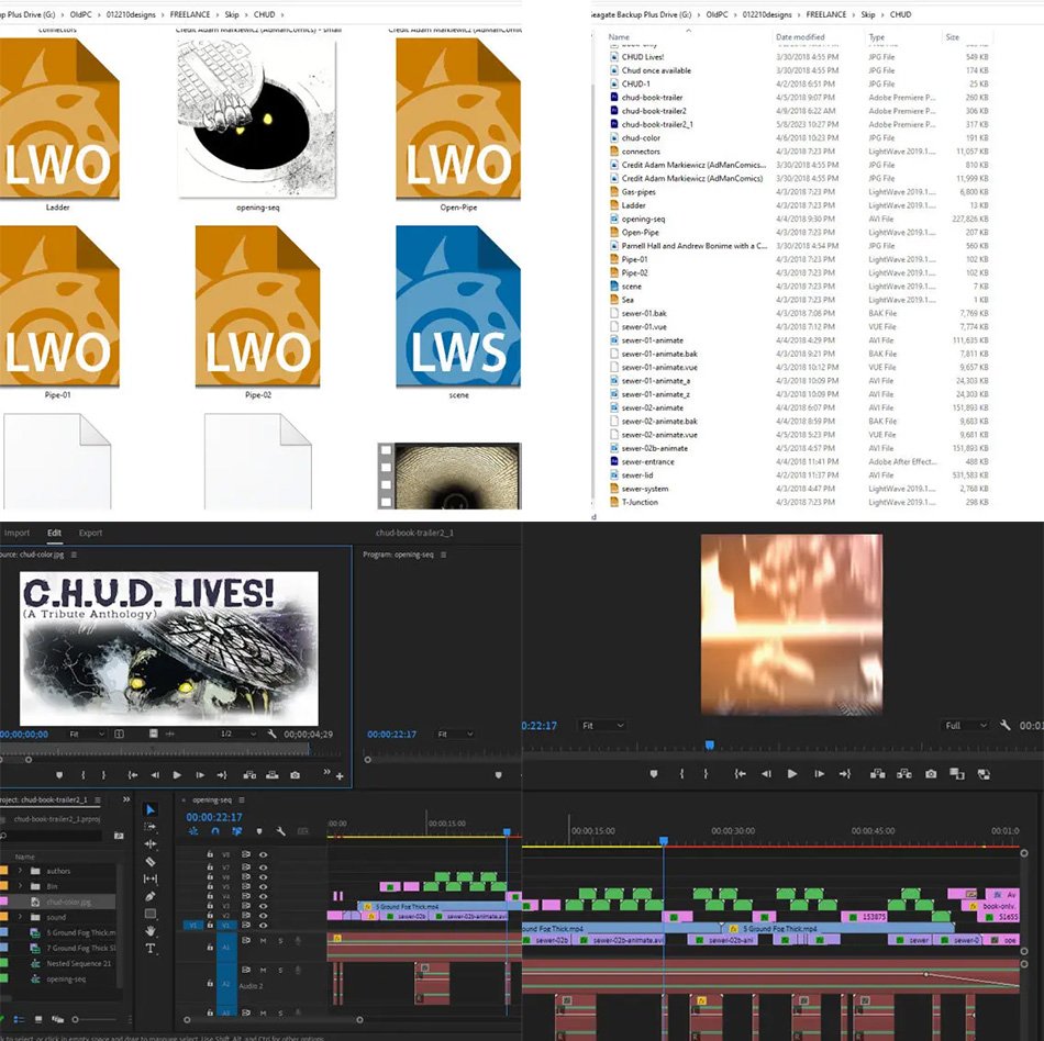
A look behind the scenes of the working file of the C.H.U.D. book trailer being assembled.